


A candlestick chart gives you a clear picture of price changes in a set time period. Each candle shows four key numbers: the opening price, closing price, highest price, and lowest price for that period. The body of the candle marks the difference between where the price started and ended, while the thin lines (called wicks or shadows) show the highest and lowest points reached.
The color of a candle matters. For example, a green or white candle usually means the price went up, while a red or black candle means the price dropped. The shape and length of the candle’s body and wicks can signal what traders are thinking. A long body suggests strong buying or selling, and short bodies may hint at indecision. If you spot a candle with a tiny body but long wicks on both ends, it could mean the market is unsure about where to go next.
What is a Candlestick?
A candlestick is a visual tool used in financial markets to represent the price movement of an asset, such as a stock or currency, over a certain period. Each candlestick on a chart shows four key pieces of information: the opening price, the highest and lowest prices reached, and the closing price during that time frame. This method makes it easy for traders and investors to quickly understand how an asset’s price has changed and to spot patterns or trends in the market, helping them make informed decisions.
What is The 3 Candle Rule?
The “3 candle rule” in trading refers to a set of candlestick patterns formed by three consecutive candles on a price chart. These patterns are used in technical analysis to help traders predict possible trend reversals or continuations in the market. By analyzing the shapes, sizes, and colors (bullish or bearish) of these three candles, traders can gauge market sentiment and make more informed trading decisions.
Common examples of three-candle patterns include:
- Three White Soldiers: A bullish reversal pattern formed by three consecutive long green (or white) candlesticks, each closing higher than the previous one, typically after a downtrend.
- Three Black Crows: A bearish reversal pattern consisting of three consecutive long red (or black) candlesticks, each closing lower than the previous one, usually after an uptrend.
- Three Inside Up/Down: A pattern that signals a potential reversal, where the first candle is large, the second candle is contained within the first, and the third candle confirms the reversal by closing beyond the range of the first candle.
Traders use these three-candle patterns to interpret shifts in momentum and market psychology, helping them identify potential entry and exit points for trades.
What is The 5 Candle Rule?
The 5 candle rule is a trading strategy designed to help traders spot reliable trend reversals and avoid false signals. It works by observing a specific pattern over five consecutive candlesticks: first, a long bearish candle, followed by three smaller bearish candles, and finally a strong bullish candle that closes above the midpoint of the initial bearish candle. By waiting for this five-candle sequence, traders can more confidently identify when a market trend might be reversing, as the pattern helps confirm the shift in momentum and filters out noise that often misleads traders using lagging indicators.
How to Read Basic Candlestick Charts for Trading
Understanding how to read candlestick charts for beginners is a key skill for anyone interested in trading. Each candlestick shows four important details about price: where the price opened, where it closed, the highest point, and the lowest point during a specific time period. The color of the candlestick also has meaning. A green (or white) candle usually means the price went up during that period, which many traders see as a sign of buying pressure. On the other hand, a red (or black) candle shows the price dropped, pointing to more selling activity.
Why Candlestick Colors Matter?
Green candles are linked to upward momentum, while red candles signal downward movement. By watching how these candles form and line up, you can spot shifts in market sentiment. For example, a long red candle after a series of green ones may hint that sellers are starting to dominate, which could lead to a trend change.
The Role of Timeframes and Volatility
The timeframe you choose—like one minute, five minutes, or daily—affects what the candlestick tells you. Shorter timeframes often show more price swings, which can make trading riskier. If you’re a beginner, focusing on longer timeframes may make it easier to spot clear trends and avoid making hasty decisions.
Volatility also plays a big role in interpreting candlestick patterns. In fast-moving markets, candles can change quickly and may give false signals. Keeping an eye on volatility helps you decide when to be cautious and when to act.
Using Candlestick Patterns in Your Trading Plan
Learning to read candlestick charts helps you make more informed choices, rather than relying on gut feelings. For example, if you see a pattern like a “hammer” after a price drop, it may suggest buyers are stepping in. Combining these patterns with other tools, such as moving averages or volume, can give you a clearer picture of what’s happening in the market.
“Candlesticks don’t predict the future, but they give traders a snapshot of crowd psychology in real time.”
You can build your confidence by practicing with risk-free practice accounts that allow you to refine your strategy before trading with real money.
If you want to practice, many free charting platforms like TradingView or MetaTrader offer live candlestick charts that let you test what you’ve learned without risking real money.
Anatomy of a Candlestick
A candlestick is a common charting tool used by traders to track price changes within a set period, such as five minutes, an hour, or a day. Each candlestick shows four main points: the opening price, the closing price, the highest price, and the lowest price for that timeframe. Because candlesticks can show sudden shifts in direction, it’s important for traders to pay attention to emotional control when interpreting their meaning in fast-moving markets.
The thick part of the candlestick, called the “body,” marks the range between where the price started and ended. If the closing price is higher than the opening price, the body is usually colored green or white, showing the price went up. If the closing price is lower, the body is often red or black, showing a drop in price. A long body means there was strong movement in one direction, while a short body suggests buyers and sellers were more evenly matched. Because candlesticks are so widely used, risk management remains an important part of interpreting their signals and making trading decisions.
Thin lines, known as “shadows” or “wicks,” stick out from the top and bottom of the body. The upper shadow shows the highest price traded during the period, and the lower shadow shows the lowest price. These shadows help traders see if prices moved far from the open or close, which can signal volatility or sudden changes in sentiment.
By looking at the size and color of the body, along with the length of the shadows, traders get a quick snapshot of market mood and can spot patterns that might hint at what could happen next. For example, a candlestick with a small body and long shadows could mean traders are uncertain, while a long green body may show strong buying interest.
Candlestick charts are popular because they make it easier to spot trends and reversals at a glance, helping traders decide when to enter or exit a trade.
In addition to candlestick analysis, many traders use technical indicators to confirm trends and improve their decision-making.
Common Candlestick Patterns
Learning how to spot candlestick patterns is a valuable skill for anyone interested in trading stocks, forex, or cryptocurrencies. These patterns can help you anticipate possible changes in market direction by showing whether buyers or sellers are gaining control. Here are four widely recognized candlestick formations and what they typically signal:
- Bullish Engulfing Pattern
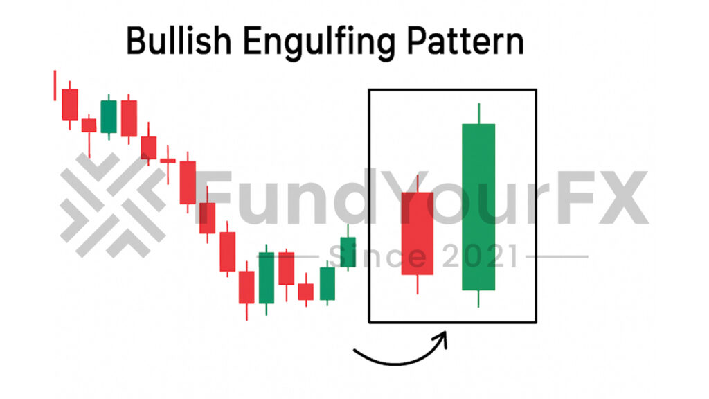
This pattern appears when a large green candle follows and completely covers the previous small red candle. It often suggests buyers are stepping in after a period of selling, which could mean prices might start to rise soon. For example, if you see this on a daily chart after a steady decline, it may be worth watching for further signs of upward momentum. In ranging markets, recognizing patterns like the bullish engulfing can help traders take advantage of support and resistance levels for strategic entries and exits.
- Morning Star Pattern
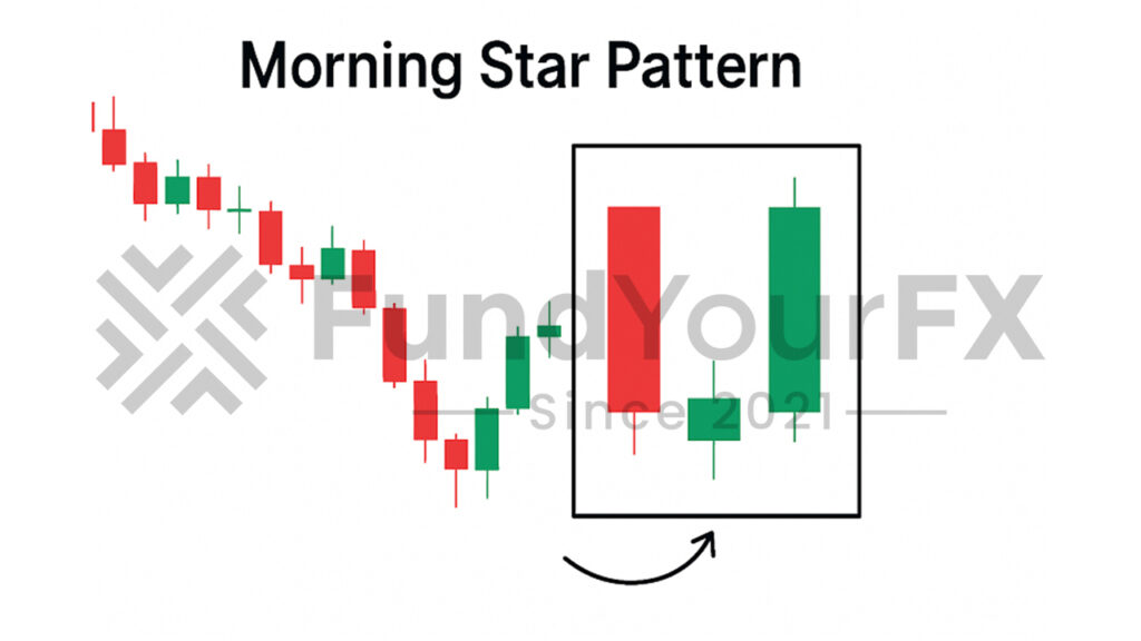
The morning star is a three-candle pattern that can point to a shift from a downtrend to an uptrend. It starts with a long red candle (showing strong selling), followed by a small-bodied candle (signaling indecision), and ends with a long green candle (showing renewed buying interest). Traders use this signal to watch for the beginning of a new upward trend.
- Bearish Engulfing Pattern
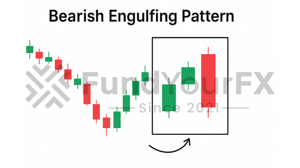
This pattern forms when a large red candle follows and completely covers a smaller green candle. It usually appears at the end of a rally and suggests sellers may be taking over, possibly starting a downward move. For instance, spotting this at the top of a recent surge could warn you of a potential drop.
- Evening Star Pattern

The evening star is another three-candle pattern, this time hinting at a reversal from an uptrend to a downtrend. It consists of a long green candle, a small-bodied candle, and then a long red candle. When this appears after a run-up in price, it’s often a sign to prepare for a possible decline.
Adding Confirmation for Better Decisions
Combining candlestick patterns with other signals—like trading volume, support and resistance levels, or technical indicators such as the RSI—can help you avoid false alarms. For example, if you spot a bullish engulfing pattern and also see rising trading volume, that increases the chance the reversal is real.
To improve your trading accuracy, it’s useful to combine candlestick analysis with fundamental and technical analysis for a more complete view of the market.
How to Read Price Trends on a Candlestick Chart?
Understanding price trends is key for anyone trading or investing in financial markets. By looking at the pattern of peaks (highs) and valleys (lows) on a candlestick chart, you can get a sense of where prices might head next. If you see the highs and lows moving upward over time, that usually means buyers are in control, and the market is trending up. On the other hand, when highs and lows keep getting lower, it signals a downtrend with sellers taking charge. It’s also useful to watch for support and resistance levels, as these often influence whether a trend will continue or reverse.
Pay attention to the shape and size of each candle. Candles with long bodies often show strong buying or selling activity—think of them as a sign that traders are confident in the current direction. In contrast, short-bodied candles suggest that buyers and sellers are unsure, and the market could be pausing before making its next move.
Another detail to watch is the length of the shadows, or wicks, above and below each candle. A long upper wick can mean that prices tried to climb but ran into resistance, while a long lower wick points to buyers stepping in and supporting prices at lower levels. These wicks provide valuable clues about where traders are placing their bets.
Specific candlestick formations, such as the morning star or evening star, can help confirm whether a trend is about to reverse or continue. For example, a morning star pattern often shows up at the end of a downtrend and can hint at a potential shift to an uptrend.
One useful technique when reading candlestick charts is to combine candle analysis with technical indicators like moving averages or the ADX, which can help confirm the strength and direction of a trend.
Comparing Candlestick Charts to Other Chart Types
Candlestick charts stand out from line and bar charts because they show more information about price changes and market psychology. Here’s what makes them different:
- More Information at a Glance
Candlestick charts display the opening, closing, high, and low prices for each time period using colored bodies and shadows (wicks). This extra detail makes it easier to see how prices moved throughout the day or hour, while line charts only plot closing prices, and bar charts are less visual.
- Clearer Market Sentiment
The colors and shapes of candlesticks quickly show whether buyers or sellers are in control. For example, a long green (or white) candle suggests buyers dominated, while a red (or black) candle signals strong selling. Line charts don’t reveal this, since they focus only on closing prices.
- Useful for Spotting Patterns
Many traders use candlestick patterns, such as “hammer” or “engulfing,” to spot possible trend reversals or continuations. These patterns are easy to recognize on candlestick charts, but much harder to identify on line or bar charts.
- Best for Short-Term Strategies
Candlestick charts are especially helpful for short-term trading, such as day trading or swing trading. They help traders react quickly to changes and spot entry or exit points. Bar and line charts are generally better for seeing the big picture over longer periods.
A Practical Example:
If you’re watching the stock market for a quick trade, a candlestick chart might show a bullish engulfing pattern—where a green candle fully covers the previous red candle—suggesting a short-term rebound. A line chart would miss this detail, potentially causing you to overlook a good opportunity.
Before relying solely on candlestick charts, it’s important for traders to have knowledge of financial markets and continuously educate themselves in order to properly interpret what these charts reveal.
Conclusion
Reading candlestick charts is a valuable skill for anyone interested in trading stocks, cryptocurrencies, or other assets. Each candle on the chart shows four key pieces of information: the opening price, closing price, highest price, and lowest price for a specific time period. By paying attention to these details, you can spot trends and gauge market sentiment more accurately.
Recognizing common patterns, such as the “hammer” or “engulfing” formations, can help you anticipate possible price movements. For instance, a series of bullish candles after a downtrend might signal a shift in momentum. However, relying only on candlestick patterns can be risky. Many experienced traders combine this approach with other tools, such as volume analysis or moving averages, to confirm signals and avoid false alarms.
Using candlestick charts as part of your routine can help you make decisions based on actual price action, rather than gut feelings. This can reduce emotional trading and improve your results over time. As trader Mark Douglas once said, “The market is never wrong in what it does; it just is.” Understanding what the candles show can help you react to what’s really happening in the market, not just what you hope will happen.